
16 Soothing Bedroom Color Ideas for a Peaceful Space
Creating a calm and restful bedroom starts with the right colors. The tones you choose can completely shape how your space feels—whether it’s soft and airy, warm and cozy, or quiet and grounding. A thoughtfully designed palette turns your room into a place where you can truly relax, recharge, and feel at ease.
A soothing bedroom color palette is all about balance. Gentle hues, muted tones, and natural shades help reduce visual stress while creating a peaceful atmosphere. When paired with soft textures and warm lighting, these colors transform your bedroom into a serene retreat.
Below are 16 soothing bedroom color ideas to inspire a peaceful and beautifully styled space.
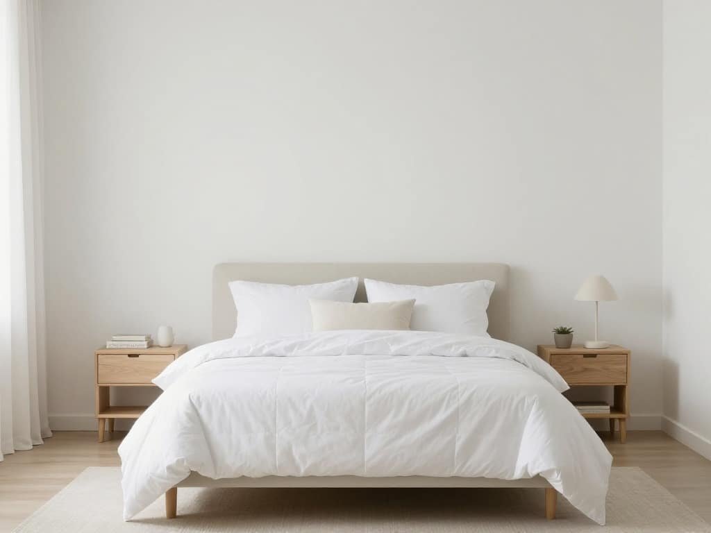
Soft White for a Clean and Calming Foundation
Soft white walls create an airy and open feel, making your bedroom look brighter and more spacious. It’s a timeless choice that pairs beautifully with any decor style.
Warm Beige for a Cozy, Inviting Atmosphere
Beige tones bring warmth without overwhelming the space. They create a comforting environment that feels grounded and relaxing.
Sage Green for a Fresh, Nature-Inspired Feel
Sage green adds a subtle touch of color while maintaining a calm, earthy vibe. It’s perfect for creating a peaceful and refreshing bedroom.
Dusty Blue for a Gentle, Relaxing Mood
Muted blue tones evoke a sense of tranquility, similar to a calm sky or ocean. They help create a soothing environment ideal for rest.

Light Gray for a Soft, Modern Look
Gray provides a neutral backdrop that feels calm and balanced. Lighter shades keep the space from feeling too heavy.
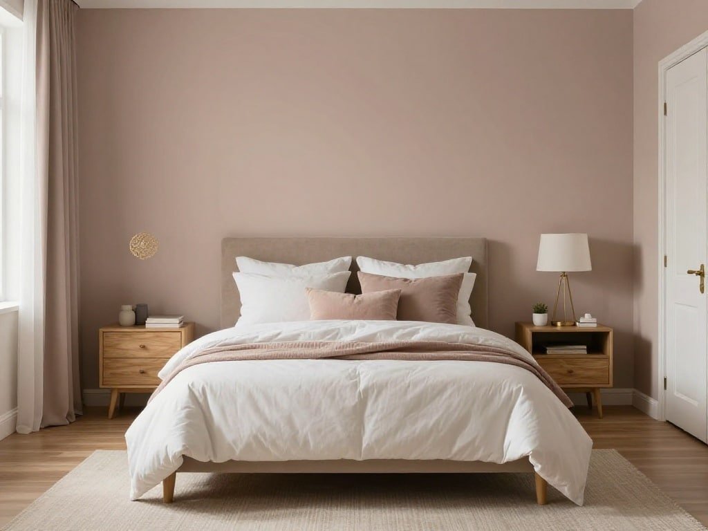
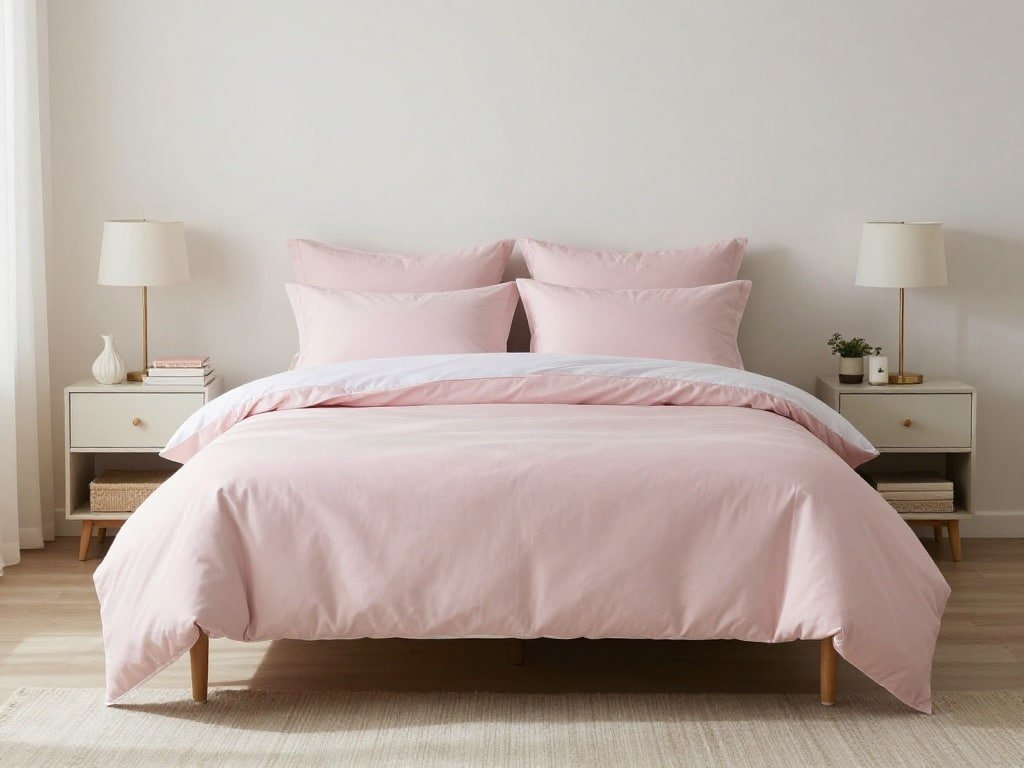
Blush Pink for a Subtle, Warm Touch
Blush pink adds a hint of warmth and softness, creating a cozy yet elegant atmosphere without feeling too bold.
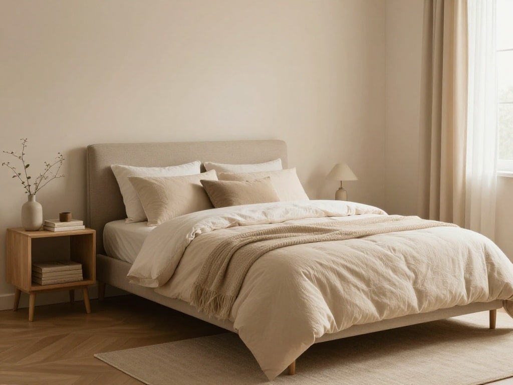
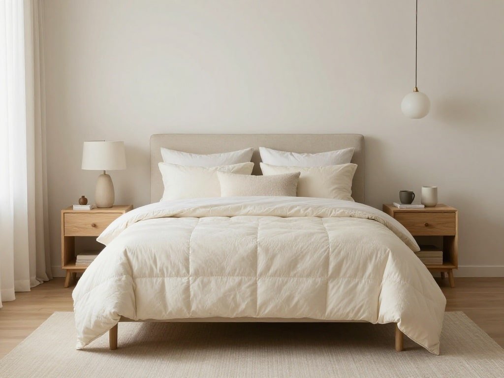
Cream and Ivory for a Soft, Layered Neutral
These tones add warmth to white while maintaining a light and airy feel. They create a refined, calming look.
Pale Lavender for a Dreamy, Serene Space
Lavender introduces a gentle, calming hue that feels soft and slightly romantic without overwhelming the room.
Muted Olive Green for Depth and Warmth
Olive green brings a richer, earthy tone that still feels grounded and peaceful. It works beautifully with natural materials.

Powder Blue for a Light and Airy Feel
This soft shade of blue keeps your bedroom feeling open and fresh while maintaining a relaxing vibe.
Taupe for a Balanced, Neutral Harmony
Taupe blends warm and cool tones, creating a versatile and soothing base that works with many styles.

Soft Peach for a Gentle, Uplifting Glow
Peach tones add warmth and a subtle brightness, making your bedroom feel welcoming and calm.
Pale Yellow for a Soft, Sunlit Effect
A very light yellow can bring a touch of warmth and positivity without being too vibrant.

Green and White for a Fresh, Clean Combination
This pairing feels crisp, natural, and calming. It’s perfect for creating a bright yet peaceful bedroom.
Warm Brown Accents for Grounded Comfort
Incorporating soft brown tones adds depth and stability, making the space feel cozy and secure.

All-Neutral Layers for a Minimal, Peaceful Look
Layering different neutral shades creates a calm, cohesive space where texture becomes the focus instead of bold color.

Conclusion / Final Thoughts
Choosing the right soothing bedroom color palette can completely transform your space into a peaceful sanctuary. Soft, muted tones help create an environment that feels calm, balanced, and inviting.
By combining gentle colors with cozy textures and warm lighting, you can design a bedroom that truly supports rest and relaxation. In the end, the most beautiful spaces are the ones that make you feel at ease—and the right colors are the first step toward that feeling.